Target wanted to be one of the first retailers to launch an app on iPad. Target and Übermind (now Deloitte Digital) worked together to design and launch the first ever iPad app for Target, and later, a redesign for iPhone. I worked as the visual designer for these projects.
Visual
2010
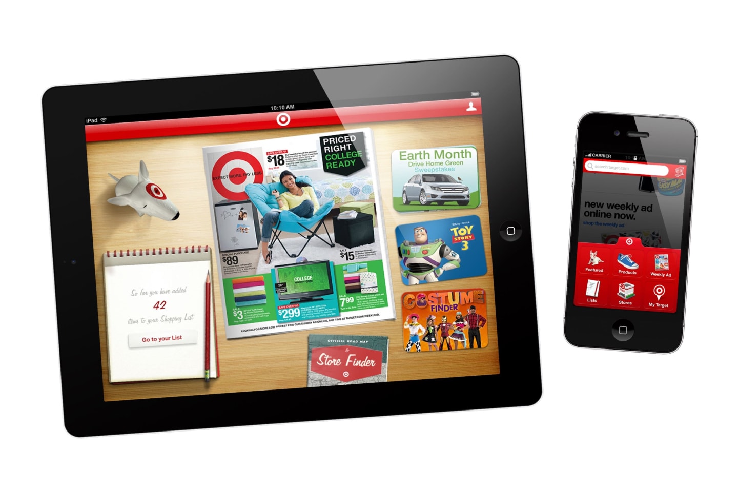
Target’s Weekly Ad on your iPad
Target was working on a big internal update to their product APIs, so we couldn’t design for anything related to browsing, product details, searching, or other things one would typically expect to see in an app for a retailer. Fortunately, there were some other APIs that were not impacted by these updates—namely the Weekly Ad, Store Details, and Seasonal Sales.
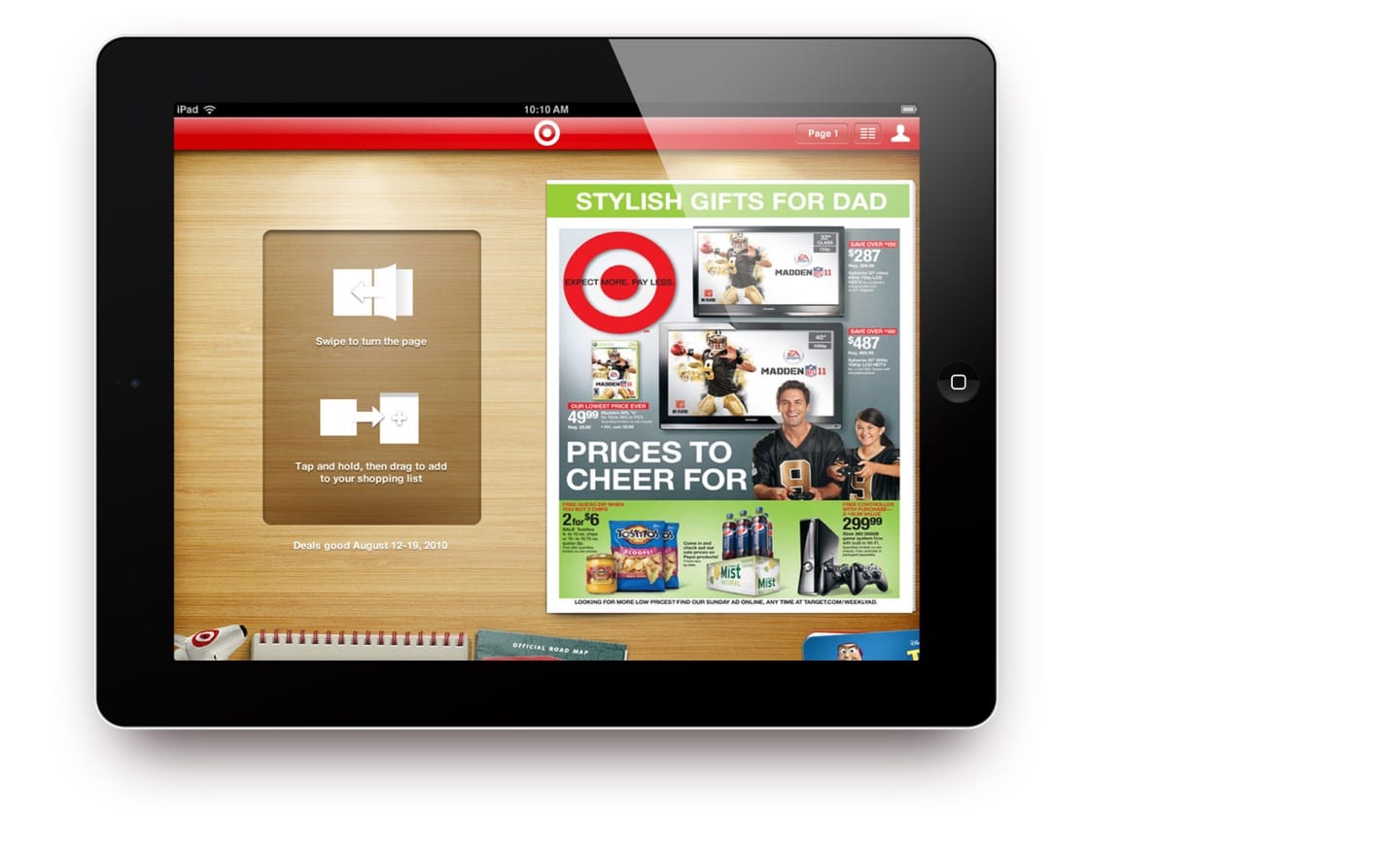
The plan for iPad was to recreate the Target Weekly Ad in the form of an app, complete with finger-tracked animated page turning, a coffee table metaphor, and all of the funky skeuomorphic design that was so popular at the time.
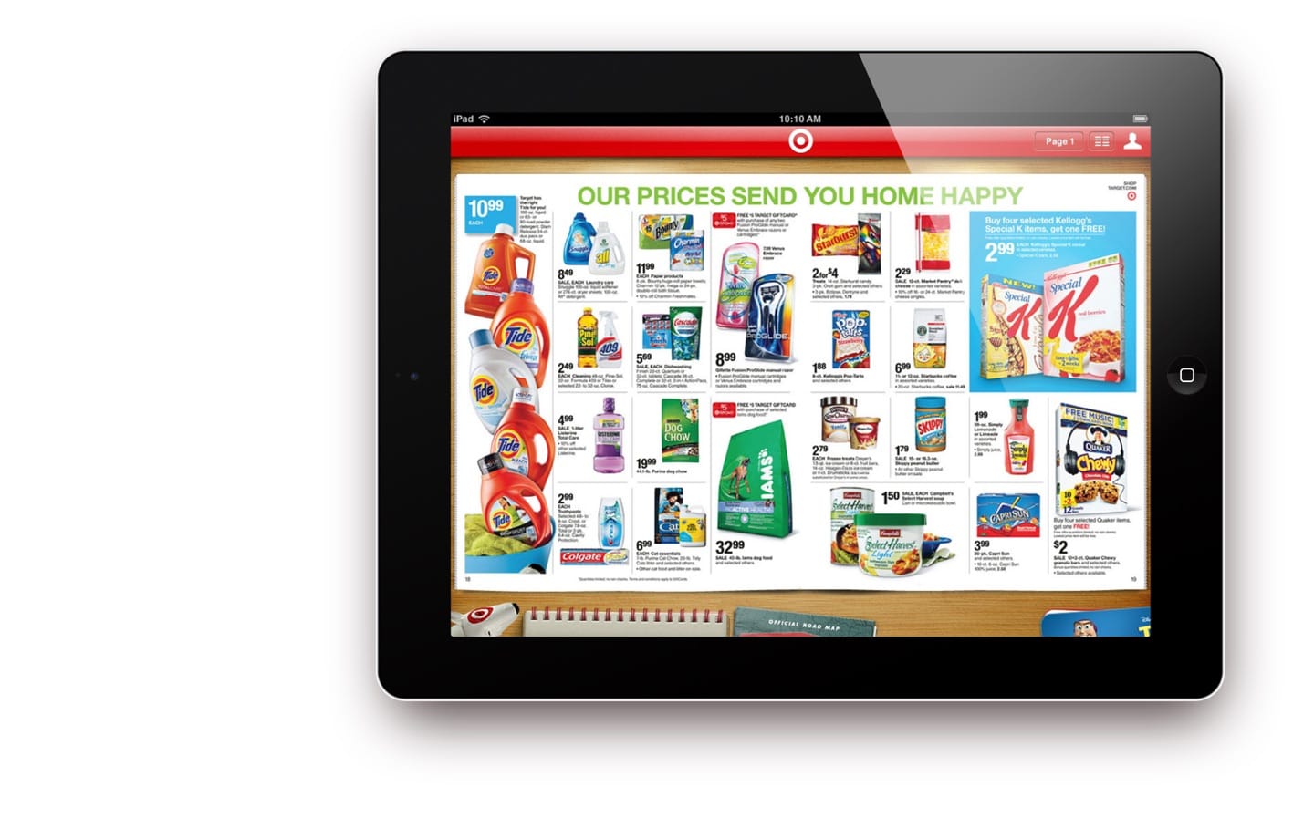
The iPad app icon echoed the heavily skeuomorphic style of the app, emphasizing the wood grain background of the app’s home screen with dramatic shading and Target’s classic color scheme.
Lessons learned
When skeuomorphism reigned
People much more eloquent than I have written at great length about the many very real issues with skeuomorphic design, which I experienced first-hand working on this project. It is fun to look back and remember how much time was spent trying to stick with the visual metaphors we had imposed on ourselves. Textures had to look realistic, shadows and highlights had to consistently appear to come from an imagined off-screen light source, and the objects on screen had to adhere to the physical properties of the real-world analogues we were emulating. These on-screen objects couldn’t pop into existence, scale up or down, or fade away, because that is not how things behave in the real world.
I remember many conversations about how things should work - not because of any UX best practice, but because of the self-imposed limitations of maintaing the skeuomorphic metaphor.
I have to laugh a bit at how silly much of this app looks now 10 years later. Yet, I still find that shadow, depth, and movement in interface design can help a great deal in directing attention, creating hierarchy, and establishing a sense of space. These things are best used as tools when appropriate, and with intention, rather than as a foundation to build upon.
An iPhone app, too
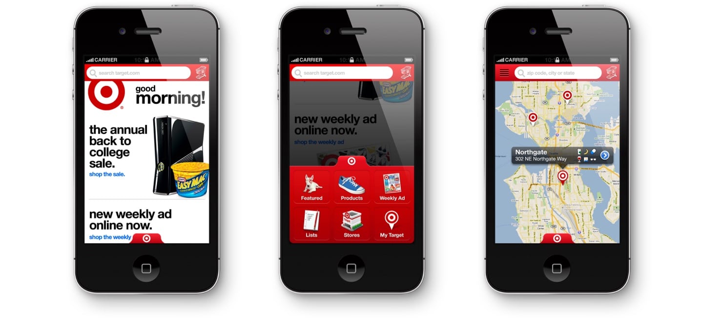
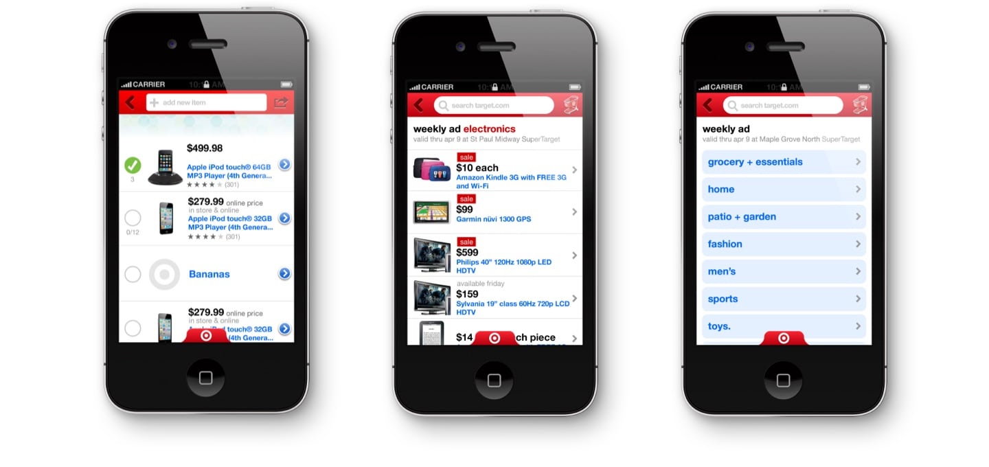
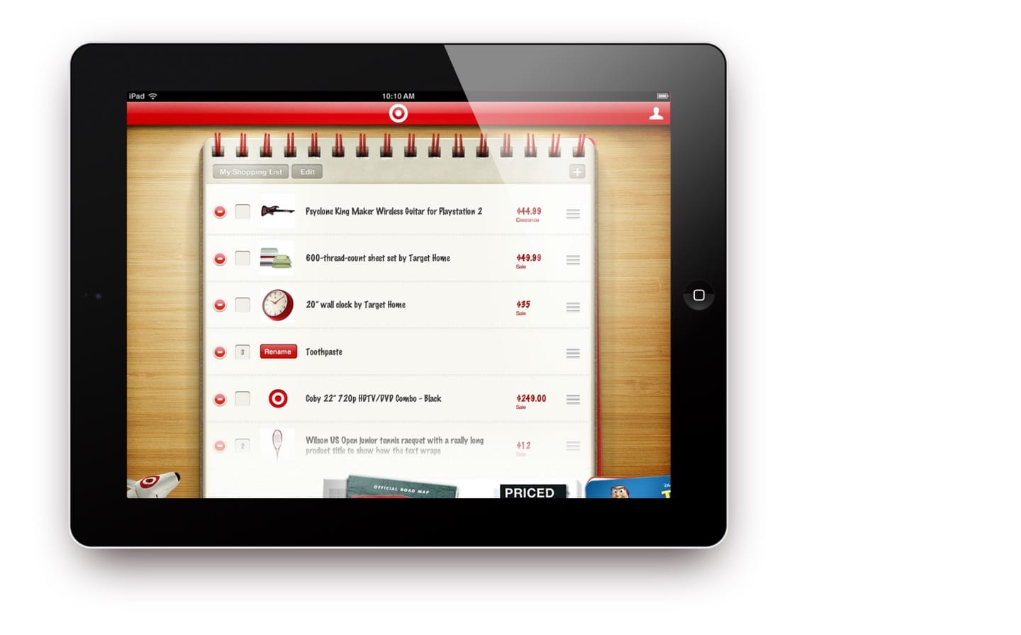
We also worked with Target to update and redesign their iPhone app, which included some new (at the time) features like shopping lists and a store finder.
We designed a custom navigation drawer, which allowed for six sections, one more than would be possible on the standard iOS tab bar. At the time, hamburger menus were just starting to appear in other apps, but we felt that enforcing an upper limit of six was a better solution because it would help keep the app more focused.
In 2012, the Target iPhone app earned a Webby award for Best Shopping mobile app.