Shoreline Community College needed a website that reflected their updated brand and core values. I worked with the web team at Shoreline to expand their new print-based guidelines into a practical system of web-friendly design patterns and atomic components, with a focus on accessibility and readability.
Visual, Brand
2019
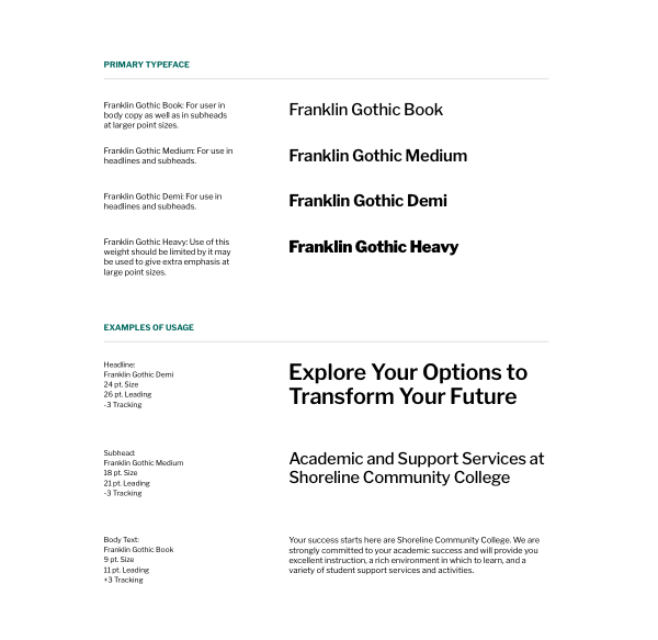
Shoreline’s new brand guidelines included only a few details about color and typography, leaving plenty of room for interpretation.
They needed a system that could support the wide variety of different page and content types across their site.
Using the existing brand guidelines a starting point, I established a more capable system of text styles for use on the web.
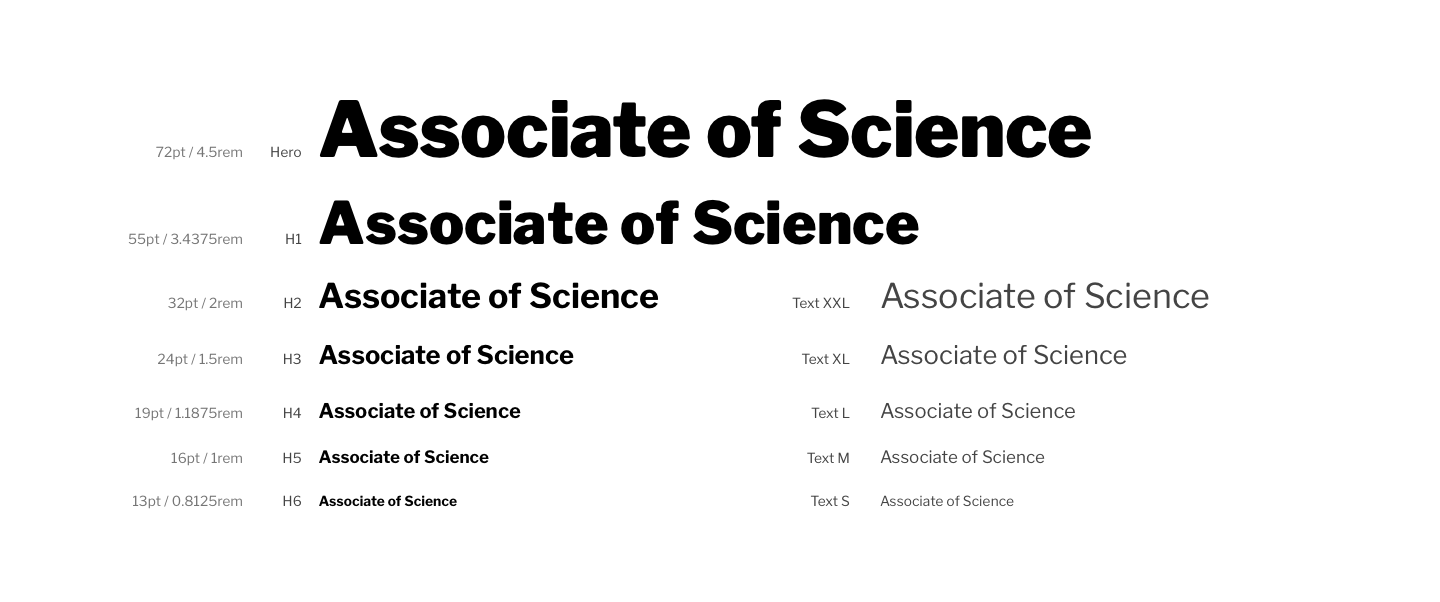
Text Styles

Brand color
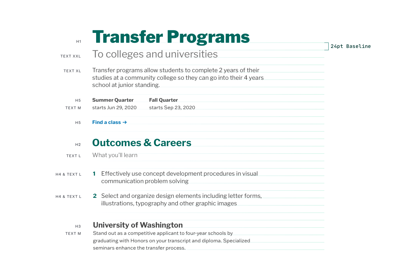
Type system in use
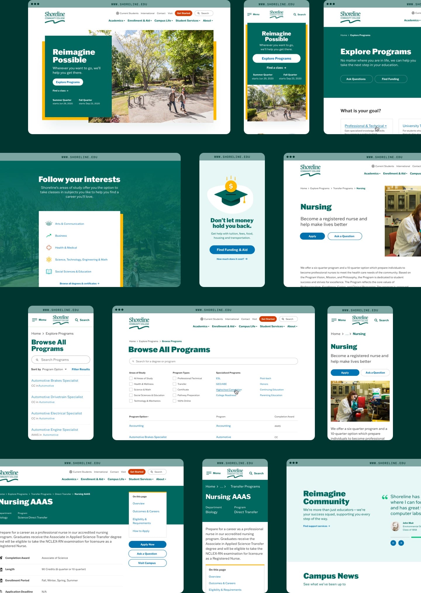
With some well-defined common styles, components, and templates, the small web team at Shoreline could begin to replace those aging pages, working toward a more consistent, maintainable, and accessible website.
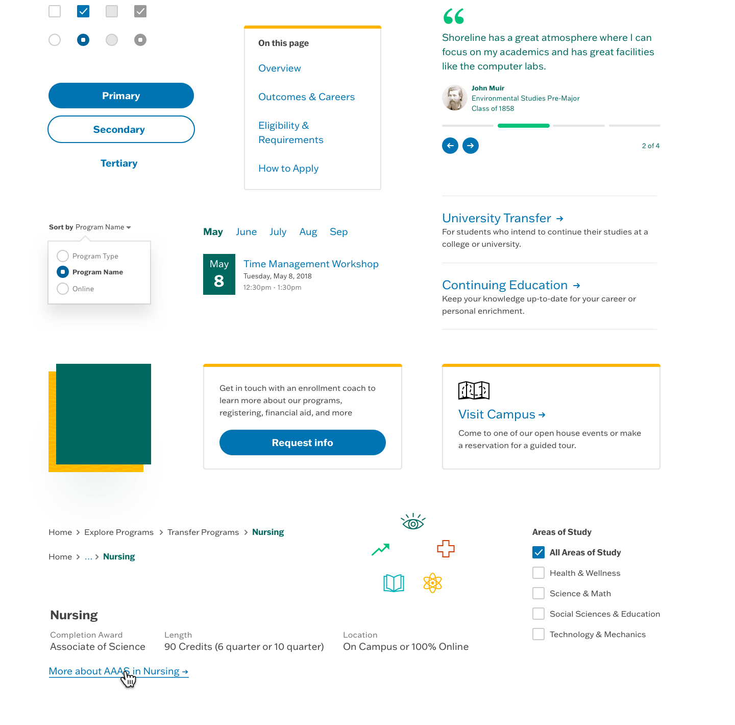
Assorted components begin to set the tone
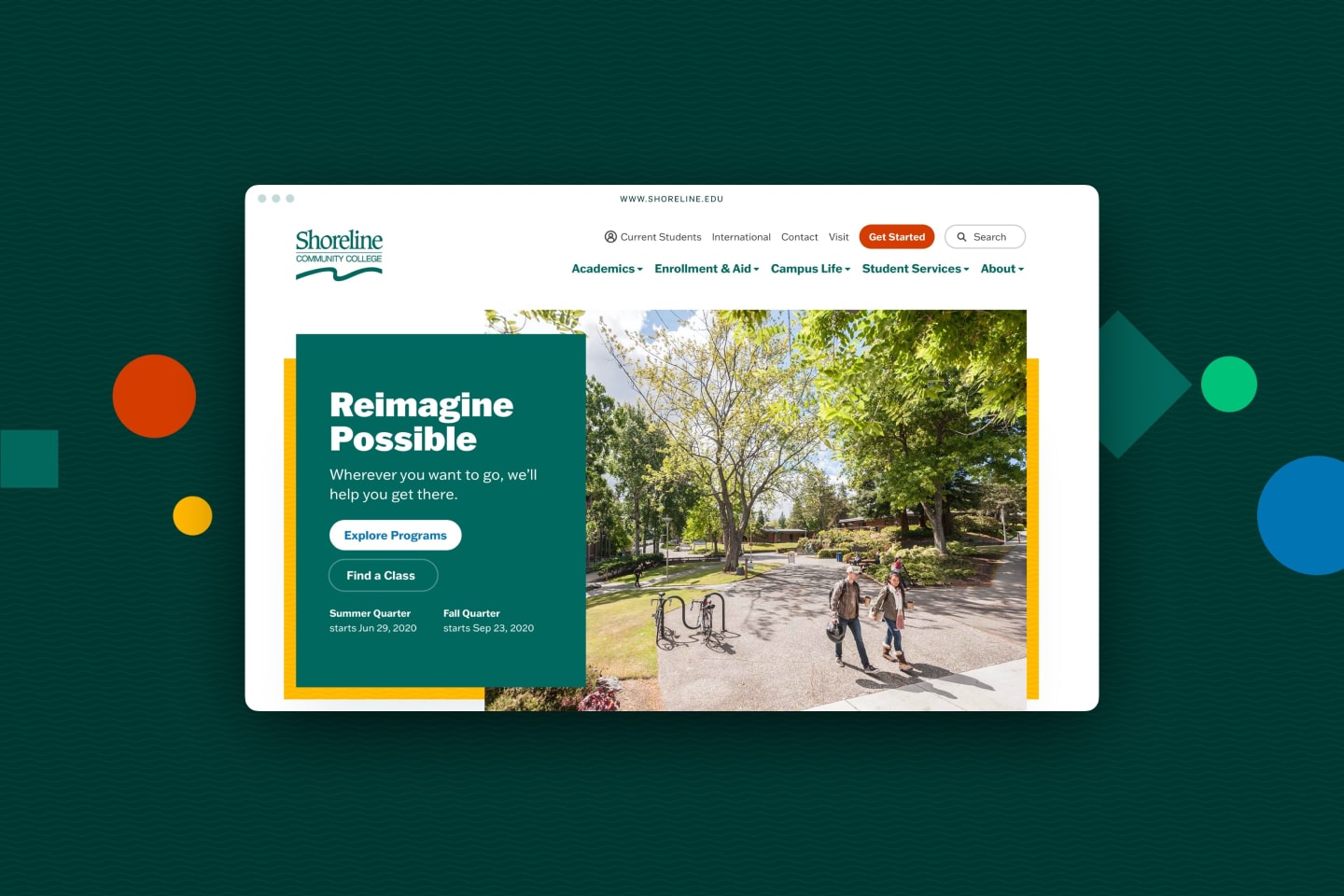
Continuing to scale upward from the rebuilt typography guidelines and component systems, a series of responsive page templates were designed to support a wide variety of content types, from higher level marketing pages for prospective students, to more information-dense administrative pages for existing students and staff.